Even during these months of the Pandemic, it’s striking to see the number of tourists lingering in Times Square, Instagramming, and TikToking their time away. What draws people to Times Square? Times Square is like a magnet where tourists flock in the thousands (174 million tourists annually in pre-pandemic times) as if hypnotized by the sparkle, the dazzle, and the scale of advertising. It is like walking into a maze of giant billboards all competing for attention, like minnows being lured by the lamp of a lantern fish before she swallows them all whole. Since its humble beginnings in the early 1900s, 42nd Street and Times Square have grown into an international brand and attraction, and a “must-see” destination for many visitors to the city, just like visiting the Statue of Liberty, Central Park, or walking the Brooklyn Bridge.
Given a 30-second spot to advertise our client, AirTerra, an up-and-coming retail shipping and logistics company was an interesting challenge. How do we stand out in this massively chaotic environment of flash and bling? What a great design challenge and opportunity for us and our barely-a-year-old client!
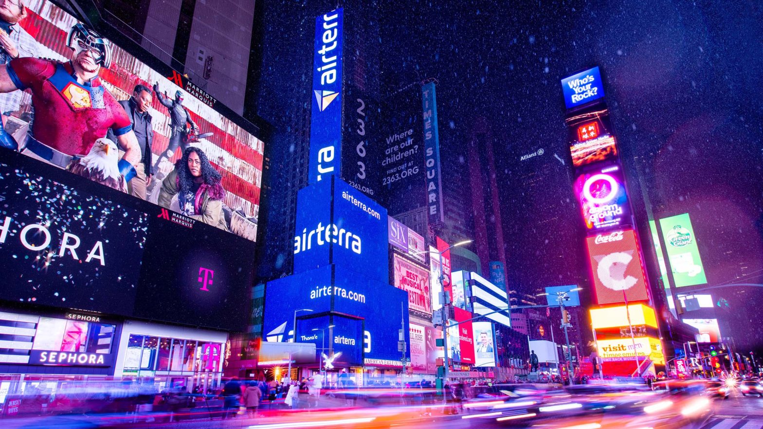
AirTerra is a little-known, yet fast-growing logistics company helping drive order and efficiency into the massively complex and chaotic world of retail direct shipping. 1551 Broadway is home to American Eagle Outfitters, and we were tasked with designing a 30-second spot that would appear every five minutes for three days in January in Times Square and at the American Eagle Outfitters store location in Las Vegas. The Times Square location is an oddly shaped building, with multiple facets wrapping around a corner building that covers over 15,000 square feet on 12 digital surfaces. That’s about 5.5 tennis courts worth of digital advertising billboard space!
As a new brand that we helped create, we kept the identity design simple and bold. There are a few big players in the delivery and logistics space, they are massive, old, and slow to adapt. By contrast, AirTerra is nimble, new, and has found its niche, allowing them to grow rapidly.

It’s surprising how one-dimensional it is to design a moving billboard. This solution is purely visual, with no sound, no tactile stimulation, and no olfactory stimulation, it is strictly a visual solution, and its only goal is to get noticed! By countering the typical billboards depicting happy people living lives that are unreachable by us mere mortals we gaze up at them in awe. Three components make up our palette: shapes, colors, and typography–no photos or videos of delivery drivers or happy people, just a focused message and colorful motion. Abstract shapes were designed that suggested packages flowing continuously, shapes that moved and shifted in a way that implied delivery and logistics told by typography. Colorful, eye-catching, and very different from surrounding billboards and experiences, the result is bright and eye-catching.
360Design is known for taking on difficult and new design challenges. We are often asked to design in new channels. In this way, I believe we have an advantage, as our team is able to take a fresh look at channels and design solutions, breaking molds of formulaic and pattern-based thinking, allowing us to challenge and delight both our clients and their audiences, and deliver results. Please contact us if you are looking for innovative and results-driven design solutions.